Website and Email Support
CMS Modules - Super Flexi Solutions
A current list of solutions available within the CMS Super Flexi module. The appearance is the default but can be changed using CSS overrides (color, font, sizing, etc). The colors will always default to your site's primary color palette.
Note: if a module doesn't work or look right when placed on a page there may need to be changes made to your site skin. Please contact us if assistance is needed.
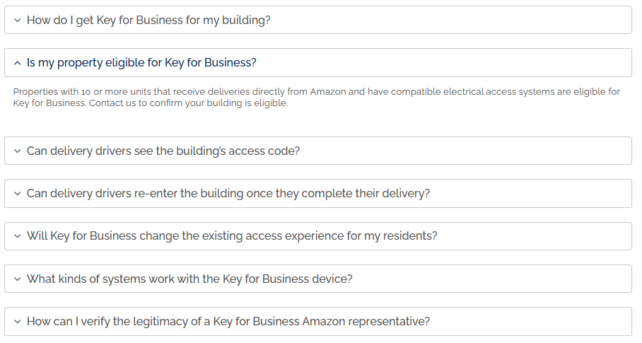
Creates vertical buttons that when clicked expand to show the content within. Works great for FAQ, job postings, product details and anything where you want to condense a lot of information into digestible chunks.
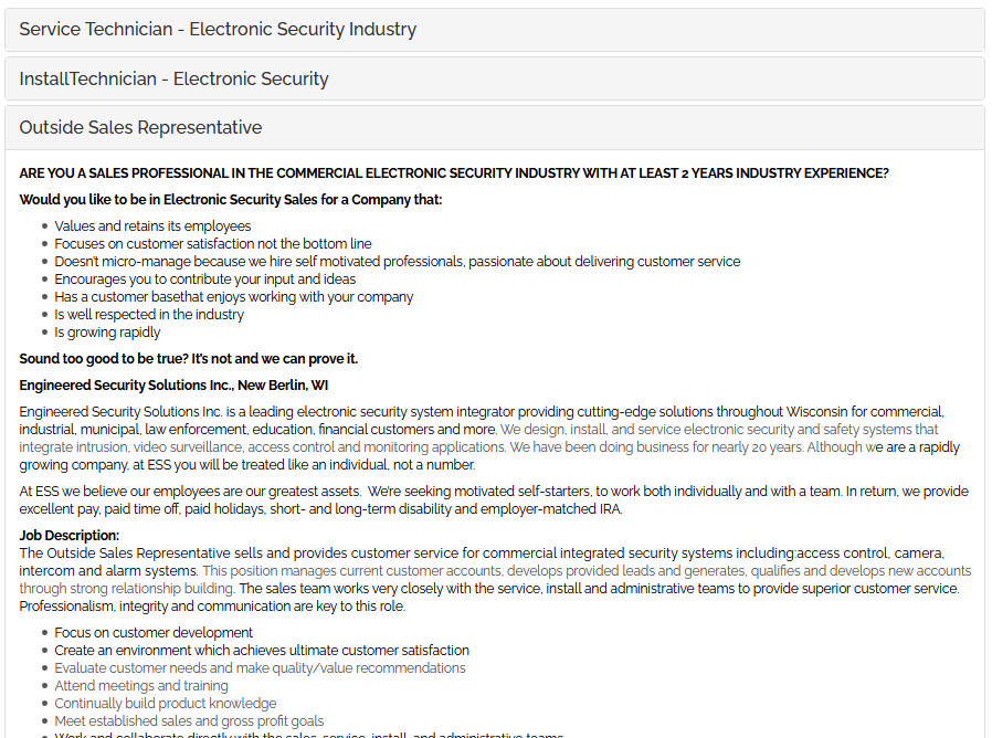
Creates vertical buttons that when clicked expand to show the content within. Works great for FAQ, job postings, product details and anything where you want to condense a lot of information into digestible chunks.

Creates vertical buttons that when clicked expand to show the content within. Works great for FAQ, job postings, product details and anything where you want to condense a lot of information into digestible chunks.
Creates a slideshow display of a large image (could be full width) with copy on top of each slide. It can hold many images and each image can have different copy and link. The slides randomly rotate automatically.
Note: Banner Slider 2 is nearly the same but the older version. It doesn't allow link button color override and shaded box shade options.

Creates a slideshow display of a large image (could be full width) with copy on top of each slide. It can hold many images and each image can have different copy and link. The slides randomly rotate automatically. This option has an interesting effect option from slide to slide that pans and zooms. There's an extra $50 per site license fee if interested. It will run in demo mode without a license.
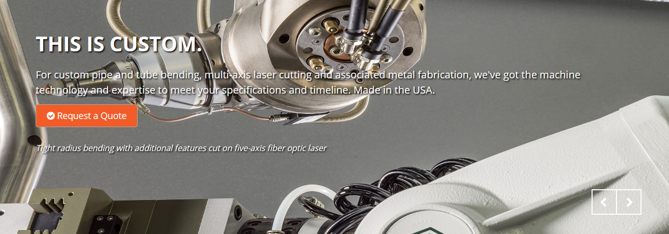
Creates a banner rotator display (could be full width) with headline, subtitle (optional), shaded box (optional), link (optional), button color override on top of each slide. It can hold many images and each image can have different copy and link. Slides do not automatically rotate, users click to advance a slide.
NOTE: Requires setting height in "settings > Advanced Settings String > (enter number of pixels)"

Creates a banner rotator display with text on the left, photo on the right (could be full width) with headline, subtitle, link and button color override. It can hold many slides. Slides do not automatically rotate, users click to advance a slide. This banner is more responsive in that the photo breaks down under the copy on mobile.
NOTE: Requires setting height in "settings > Advanced Settings String > (enter background HEX color)"

Creates a banner rotator display with text on the left or right and a photo in the background. There are many configurable options including: photo, photo black overlay opacity, text color, kicker copy, title, subtitle, box behind copy, copy box location (left/right), URL, button color. It can hold many slides. Slides automatically rotate and are random, users can click to advance a slide. This banner is responsive in that the copy breaks down under the copy on mobile.
Slide Options: Photo, Slide Black Overlay Opacity, Text Color, Slide Kicker, Slide Title, Slide Subtitle, Shaded Box Behind Copy, Copy Box Location, Link URL, Button Color Override, SVG Shape Code
NOTE: You can override the mobile text background color in "settings > Advanced Settings String > (enter background HEX color)"

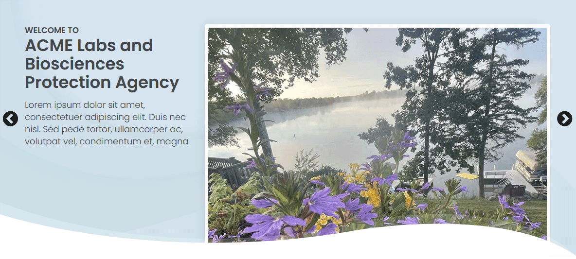
A banner slider with a photo to the right and headline, description and button to the left. A SVG background can be set as well as shown.
SLIDE OPTIONS: Slide Kicker, Title, Description, Link URL, Button Color Override, Photo
NOTE: Requires setting the photo path in "settings > Advanced Settings String > (enter path. ex: /data/sites/42/media/home/photo.jpg)"
Builds a horizontal list of buttons which default to the site style and color. Buttons can link to documents, internal pages or external sites.

Builds a horizontal list of buttons that can wrap to multiple rows. Can be setup in different number of columns such as 2, 3, 4, 6. Buttons can link to documents, internal pages or external sites. Button color and button text color can be changed.
NOTE: Requires setting number of columns in "settings > Advanced Settings String > (enter number of columns)"

Displays a grid of copy boxes. With each block you can choose the headline, copy, text alignment, URL and botton override color. The rows grow automatically as more buttons are added. As the boxes are rolled over there's an effect where the background box color changed.
NOTE: Requires setting number of columns in "settings > Advanced Settings String > (enter number of columns)"

Displays a grid of copy boxes. A similar but different design compared to Copy Box 1 with the following settings (Title, Icon Selector, Accent Color, Main Copy, URL, Show Button). The rows grow automatically as more buttons are added. As the boxes are rolled over there's an effect where the background box color changed.
NOTE: Requires setting number of columns in "settings > Advanced Settings String > (enter number of columns)"

An interactive counter that counts each number up. There are settings for (Number, Extra characters before number, Number Color Override (HEX), Text under the number, Display right vertical line).
NOTE: Requires setting number of columns in "settings > Advanced Settings String > (enter number of columns)"
ADD TO SKIN (IN FOOTER) <script src="/data/sites/47/skins/skin-03/assets/js/components/hs.counter.js"></script>
ADD TO SKIN IN SCRIPT BLOCK (IN FOOTER) $.HSCore.components.HSCounter.init('[class*="js-counter"]');

An interactive counter that counts each number up. There are settings for (Main number, Extra characters before number, Text under number, Text under number color (HEX), Number color (HEX), Box color (HEX), Border color (HEX)).
NOTE: Requires setting number of columns in "settings > Advanced Settings String > (enter number of columns)"
ADD TO SKIN (IN FOOTER) <script src="/data/sites/47/skins/skin-03/assets/js/components/hs.counter.js"></script>
ADD TO SKIN IN SCRIPT BLOCK (IN FOOTER) $.HSCore.components.HSCounter.init('[class*="js-counter"]');

An interactive counter that counts each number up. There are settings for (Main number, Extra characters before number, Text under number, Circle color (HEX), Text under number color (HEX), Number color (HEX)).
NOTE: Requires setting number of columns in "settings > Advanced Settings String > (enter number of columns)"
ADD TO SKIN (IN FOOTER) <script src="/data/sites/47/skins/skin-03/assets/js/components/hs.counter.js"></script>
ADD TO SKIN IN SCRIPT BLOCK (IN FOOTER) $.HSCore.components.HSCounter.init('[class*="js-counter"]');

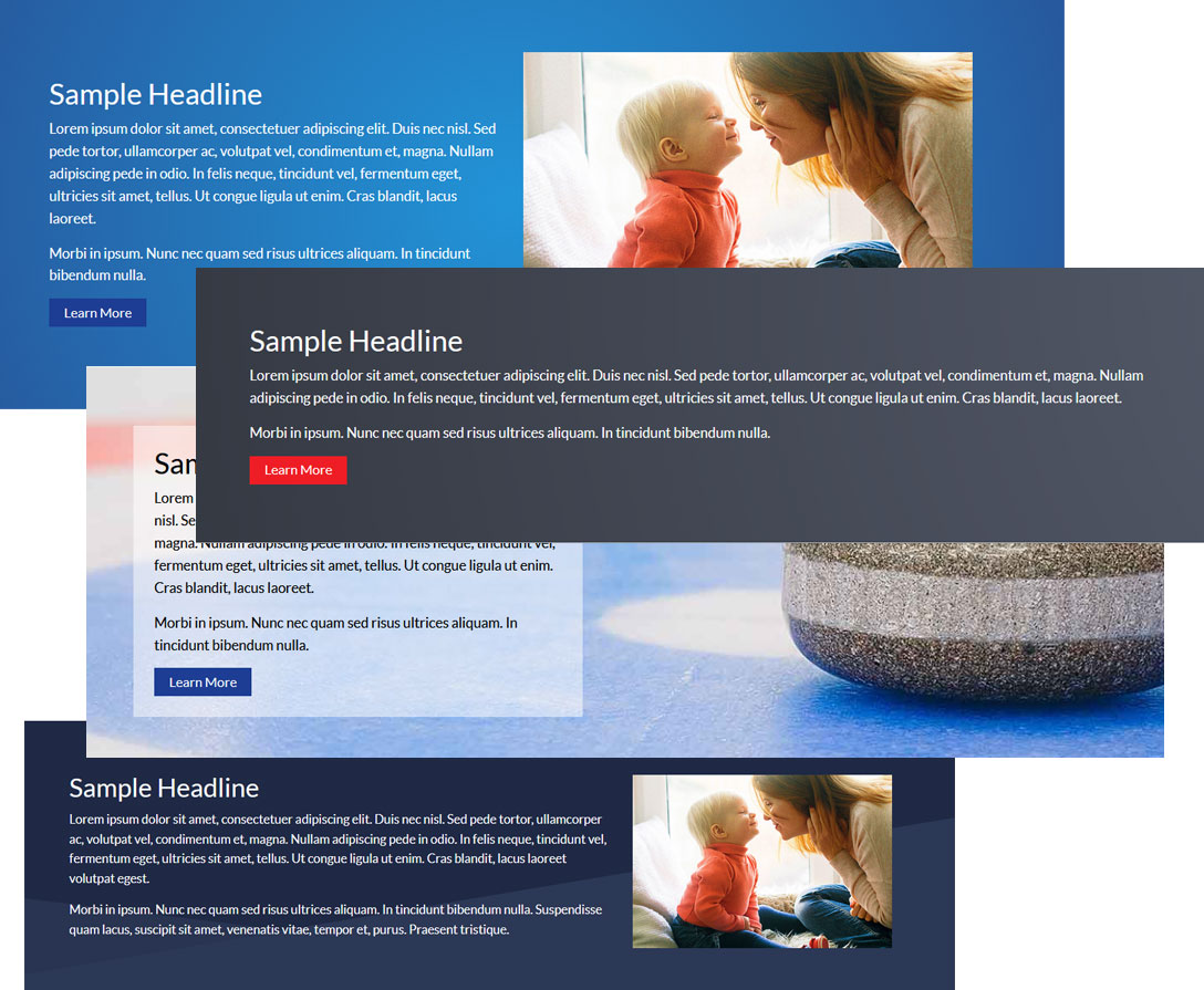
A single hero banner with many configurable options as shown in these examples.
Displays a grid of icon buttons. With each icon block you can choose an icon, title, color, description and link. The rows grow automatically as more buttons are added.
Displays a grid of icon buttons (squares). With each icon block you can choose an icon, title, color and link. The rows grow automatically as more buttons are added. As the boxes are rolled over there's an effect where they slightly grow in size.
NOTE: Requires setting number of columns in "settings > Advanced Settings String > (enter number of columns)"
Displays a grid of icon buttons (circle). With each icon block you can choose an icon, icon color, circle color, title, description (optional), and link (optional). The rows grow automatically as more buttons are added. As the icons are rolled over there's an effect where they slightly grow in size.
NOTE: Requires setting number of columns in "settings > Advanced Settings String > (enter number of columns)"
Displays a grid of icon buttons similar to Icon Blocks 3 but with this version you selet an image instead of from a list of icons. With each icon block you can choose a graphic (icon, button or otherwise), title, description (optional), and link (optional). The rows grow automatically as more buttons are added. As the icons are rolled over there's an effect where they slightly grow in size.
NOTE: Requires setting number of columns in "settings > Advanced Settings String > (enter number of columns)"
Displays a grid of icon buttons (rectangle). With each icon block you can choose an icon, icon color, rectangle box color, title, and link (optional). The rows grow automatically as more buttons are added. As the icons are rolled over there's an effect where the background box is slightly darkened.
NOTE: Requires setting number of columns in "settings > Advanced Settings String > (enter number of columns)"
Displays a grid of links with icons to the left. Three across and unlimited rows.
SLIDE OPTIONS: Block Title, Description, Link URL, Icon, Icon HEX Color
Displays a list of links with icons to the left. There's a setting for the list to be vertical or horizontal. Options for each link include: text/icon size, icon color, url, icon selection, link underline option.
Displays a grid of photo boxes. With each box you can choose a photo, underline/hover color, initial copy, rollover copy, button label and URL. The rows grow automatically as more boxes are added. When a box is rolled over there's an effect where a color replaces the photo and text is layered on top.
NOTE: Requires setting number of columns in "settings > Advanced Settings String > (enter number of columns)"

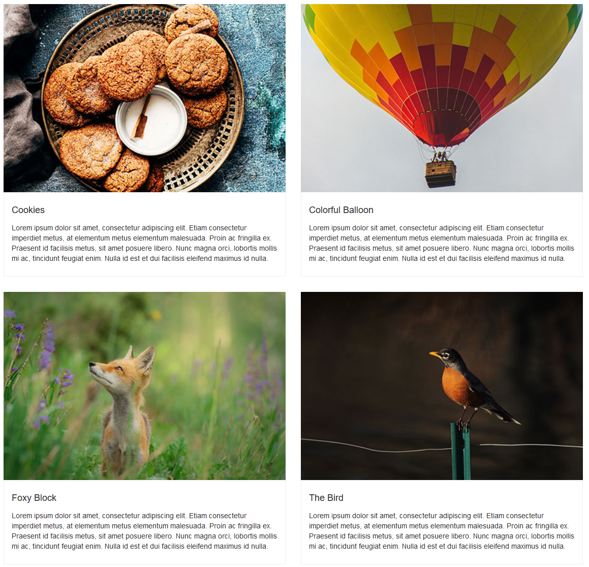
Displays a grid of photos with descriptions. Two across, with an image, title and description.
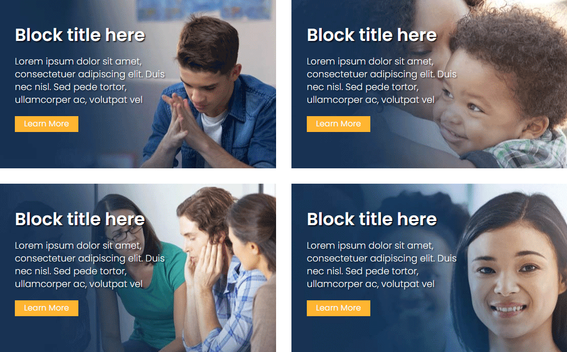
Displays a grid of photos with a Title, Description and Link button to the left. Blocks have a zoom effect when hovered over.
SLIDE OPTIONS: Title, Description, Photo, URL, Button label, Button color, Box height, Copy animation type
NOTE: Requires setting number of columns in "settings > Advanced Settings String > (enter number of columns)"
Displays a grid of photos with descriptions. Three across, with an image, title and link. Photos have a zoom effect when hovered over.

Displays a grid of photos with descriptions. Three across (multiple rows), with an image, title, date (optional) and link. Photos have a zoom effect when hovered over. Box shadow with border.

Displays a grid of photos with descriptions. Three across (multiple rows), with an image, title and link. Photos have a zoom effect when hovered over.
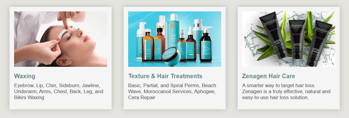
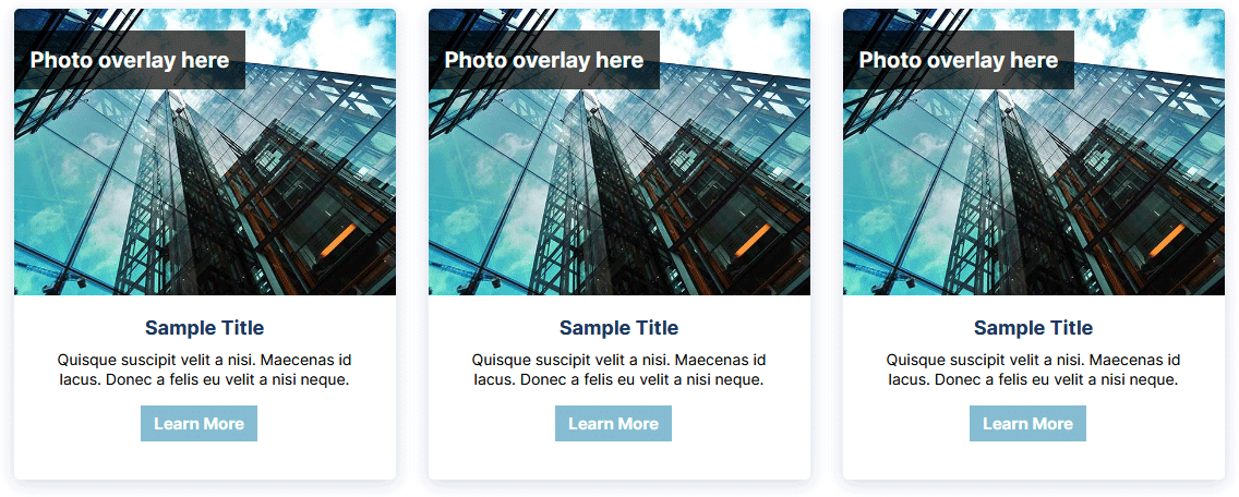
Displays a grid of photos with descriptions and overlay. Each block can contain a title, description, photo, URL and a customizable button name. Blocks have a zoom effect when hovered over.
NOTE: Requires setting number of columns in "settings > Advanced Settings String > (enter number of columns)"
Displays a grid of photos with descriptions. There's a zoom effect when hovered over. When clicked the photo pops up in a larger modal mask display.
NOTE: Requires setting number of columns in "settings > Advanced Settings String > (enter number of columns)"
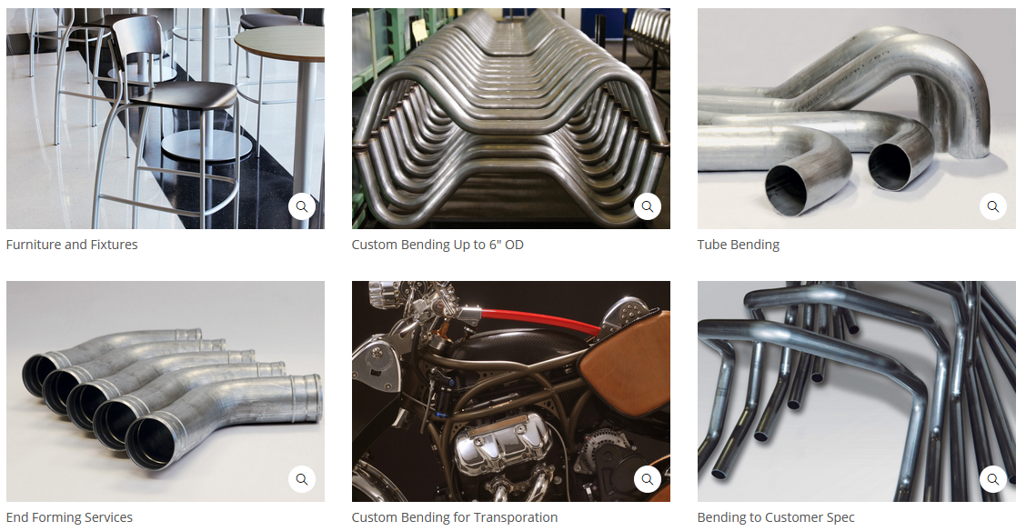
Displays a grid of photos with descriptions (on the popup). There's a zoom effect when hovered over and a black overlay (optional). When clicked the photo pops up in a larger modal mask display.

Image slider. Displays arrows to navigate the photos. Each photo can have a small description.
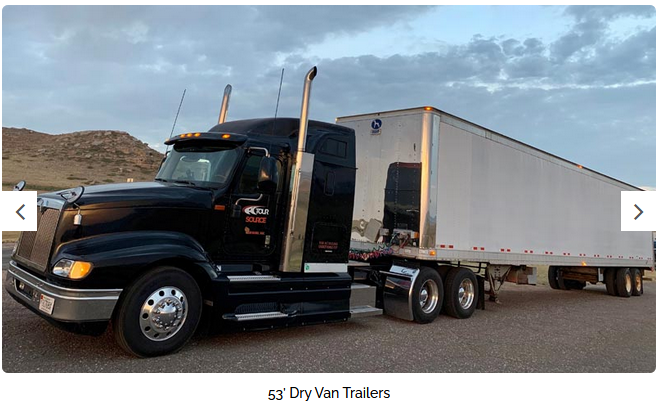
Image slider with random slides. Photos rotate automatically. Displays arrows to navigate the photos.

Load up some logos and this will create a horizontally scrolling list. Good for when you have more logos than horizontal space as this can hold many dozens of logos if needed (or any type of graphic file).
NOTE: Requires setting height in "settings > Advanced Settings String > (enter number of pixels)"

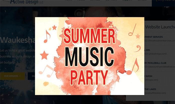
Creates an automatic modal popup window when a page is loaded. The popup can be turned on/off with a checkbox. In the window you can place text and graphics, links, video, etc. The window can be closed.
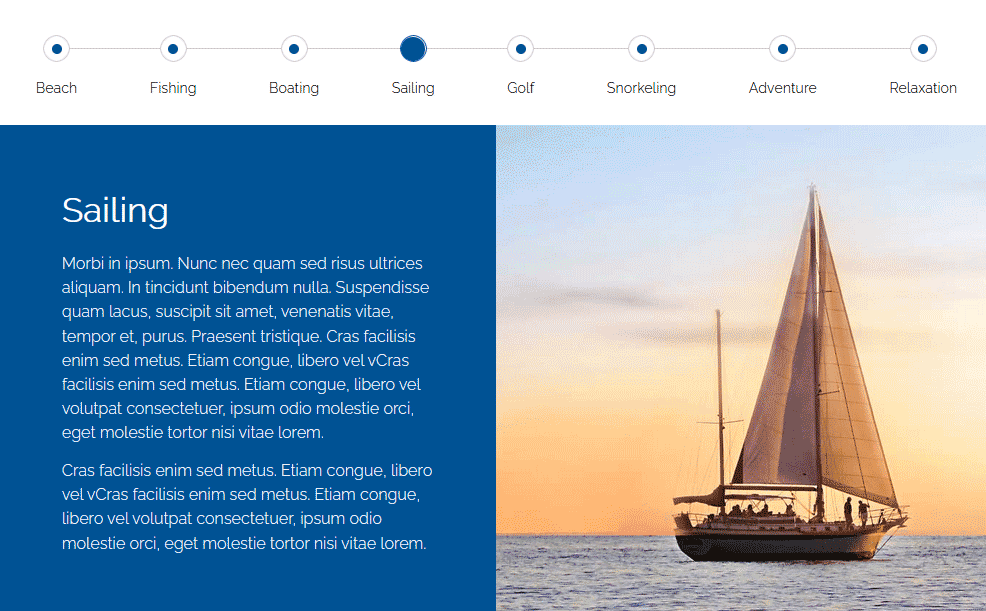
Displays slides that are clickable from the top nav. Each slide has a text area, a photo (700px X 700px) and an optional link button.
Advanced setting string allows you to set a custom HEX color for the slide background color.
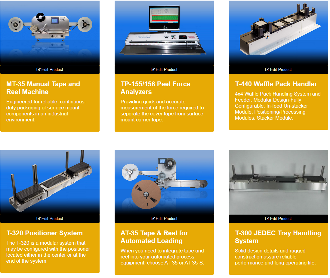
Creates a grid layout as shown, three across. Includes a photo, title, description and link option. When hovered over there's a slight movement effect.
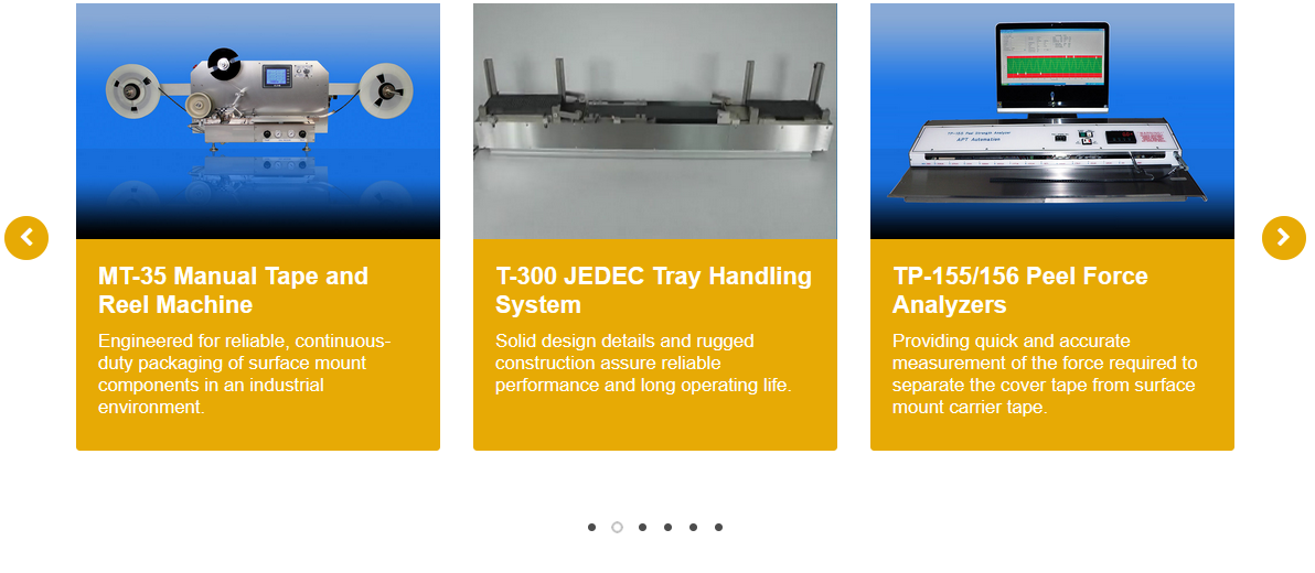
Creates horizontal box scroller. Includes a photo, title, description and link option. Boxes will scroll with the arrows when clicked (repeats when at the end). When hovered over there's a slight movement effect.
NOTE: Requires setting number of boxes to show in "settings > Advanced Settings String > (enter number of boxes)"
Creates horizontal box scroller. Includes a photo, title and link option. Boxes will scroll with the arrows when clicked (repeats when at the end). When hovered over there's a dark overlay and the title apepars.
NOTE: Requires setting number of boxes to show in "settings > Advanced Settings String > (enter number of boxes)"

A simple way to create content chunks that is responsive. An image to the left, with title, description and link option to the right. Stacks vertically as more are added with a grey horizontal line in between. Field options include block name, copy, photo, photo caption, block background color and URL. Two examples of different ways this could be configured are shown.
NOTE: Requires setting number of columns in "settings > Advanced Settings String > (enter number of columns)"
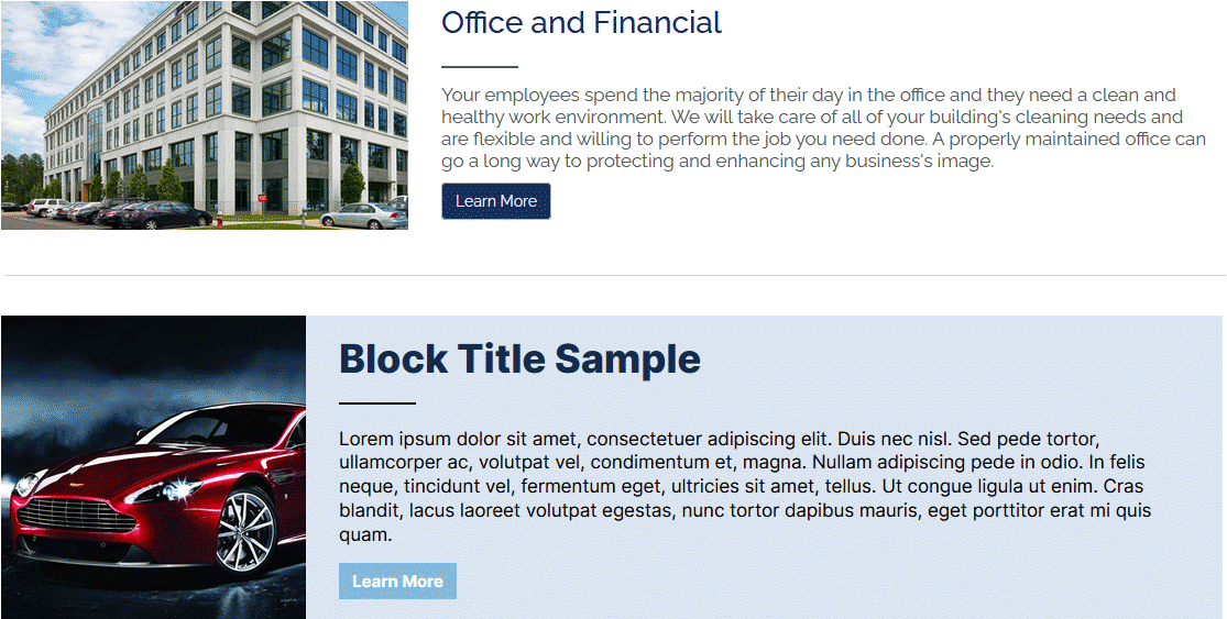
A simple way to create content chunks that is responsive. Like Service Blocks v1 but with a different layout.
Create a social media icon row. Let's you select from popular social media platforms and customize for your site. Each button links to your profile. Nice to include on a contact page.

Creates horizontal buttons that when clicked expand to show the content within. Works great for FAQ, job postings, product details and anything where you want to condense a lot of information into digestible chunks. You are limited to one link of copy since wrapping will not look as nice. The "collapsed" version starts the page with all the tabs closed.

Creates horizontal buttons that when clicked expand to show the content within. Works great for FAQ, job postings, product details and anything where you want to condense a lot of information into digestible chunks. You are limited to one link of copy since wrapping will not look as nice. The "collapsed" version starts the page with the first tab content open.

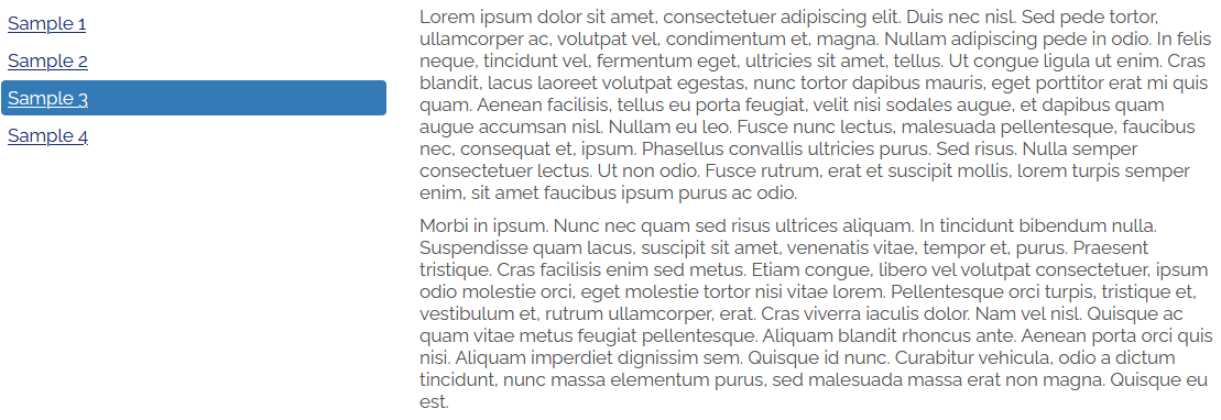
Creates vertical buttons on the left that when clicked show content off to the right.
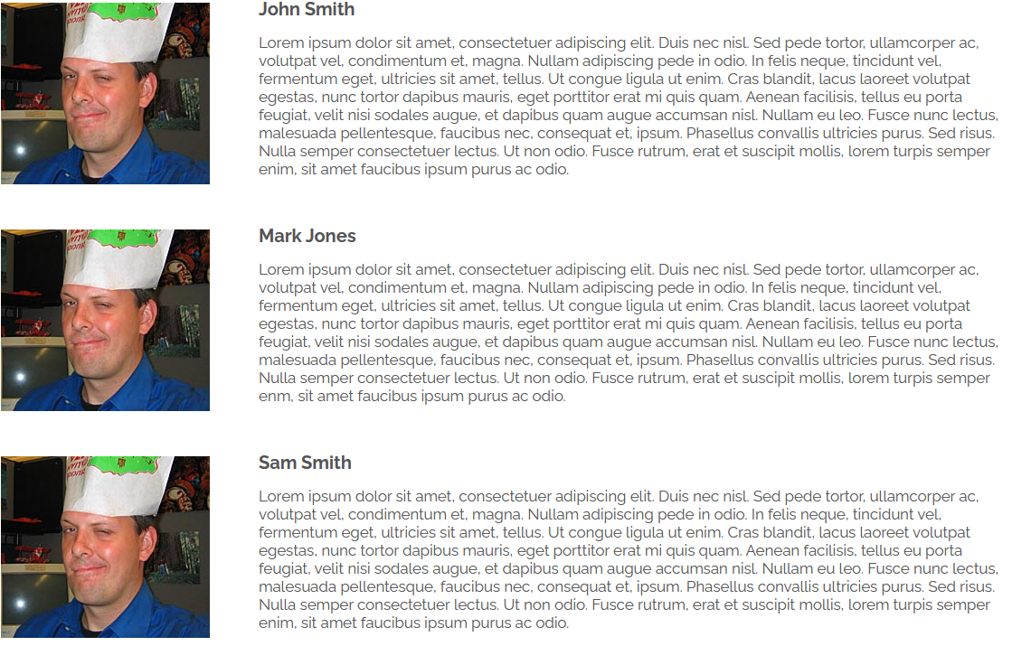
A simple solution for displaying a vertical list of images with a title and copy to the right. Would work good for listing your team members or possibly a simple product list.
NOTE: Requires setting photo column size in "settings > Advanced Settings String > (enter number of 1, 2, 3, 4, 6, 12)"
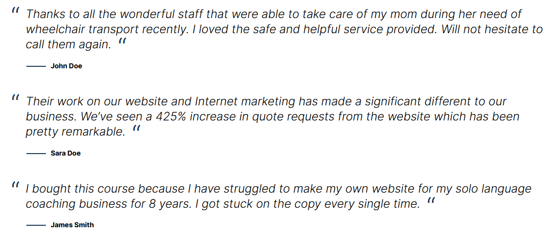
Testimonial list in vertical order. Easy to manage.
Testimonial rotator with navigation arrows. You can embed this on a page and display one or more testimonials with easy management. Ideally you want to keep the testimonial copy shorter and around the same length. Not more than a sentance or two for this kind of display.

Testimonial rotator with navigation arrows and single photo background. You can embed this on a page and display one or more testimonials with easy management. Ideally you want to keep the testimonial copy shorter and around the same length. Not more than a sentance or two for this kind of display.
NOTE: Requires setting the photo path in "settings > Advanced Settings String > (enter path. ex: /data/sites/42/media/home/photo.jpg)"

Testimonial rotator with a static photo to the left and testimonials to the right with navigation arrows.
NOTE: Requires setting the photo path in "settings > Advanced Settings String > (enter path. ex: /data/sites/42/media/home/photo.jpg)"

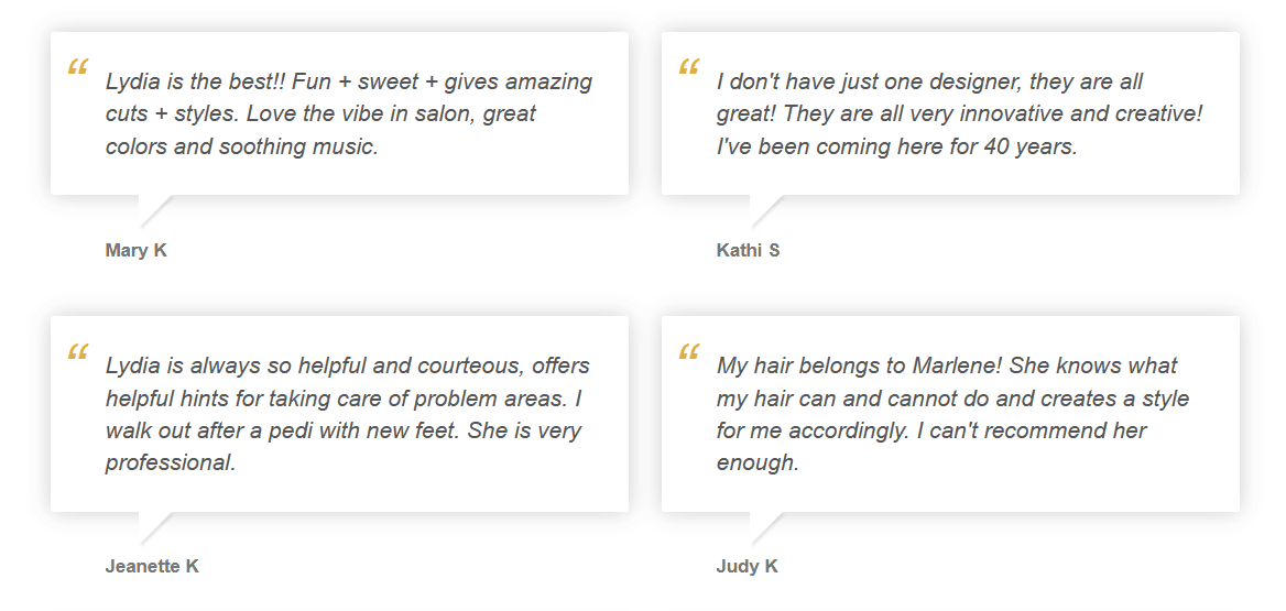
Testimonials in two column layout that builds vertically down the page. For best result keep the testimonials about the same length to avoid layout gaps.
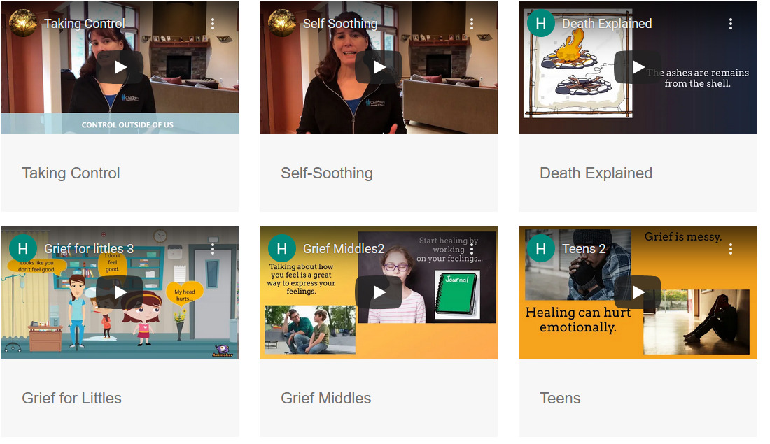
Displays a grid of YouTube videos, three across. With each video block you choose the video ID and title. The rows grow automatically as more buttons are added. Videos display within the grid but can be expanded full screen.
